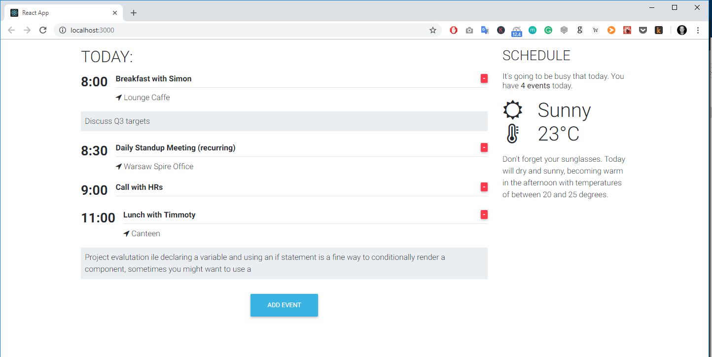
We will start building our app by setting up the two column structure of our app. As you can see in the demo app our app consists of two columns: the first, on the left and wider, which lists all the daily events; and the right hand one - which shows the events counter as well as the weather forecast.
As you also noticed our app will be responsive. This is thanks to Bootstrap 4. In this lesson, we will learn how to use a Bootstrap grid in Angular.
Disclaimer: I will explain the key concepts and basic usage here. If you want to master Bootstrap usage I strongly suggest to finish this course first and come back here.
1. Open the project
In order to start building our project let's open a boilerplate which I have prepared for you in Tutorial files which you downloaded before.
- Open the
agenda-app/start-hereproject in code editor - Replace the content of the
src/app.component.htmlandsrc/app.component.scssfile with the following code:
- Added a container, with a row and two columns inside within app.component.html
- Added a style to make our grid borders visible inside the app.component.scss
What we did:
1. The concept of the grid
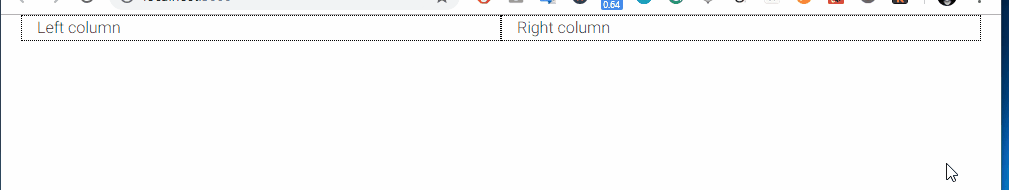
Currently, our app has two equal-sized columns which are placed next to each other on a large screen. When we resize our browser window they will nest one beneath the other:
What is the Bootstrap Grid?
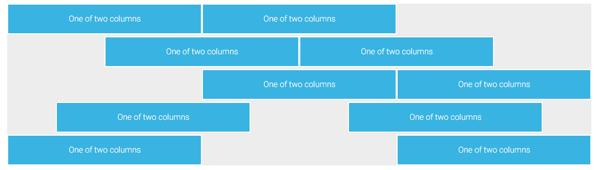
In nutshell, it's a mechanism which allows us to create a responsive website. The Bootstrap grid allows us define rows, and each row consists of up to 12 columns.
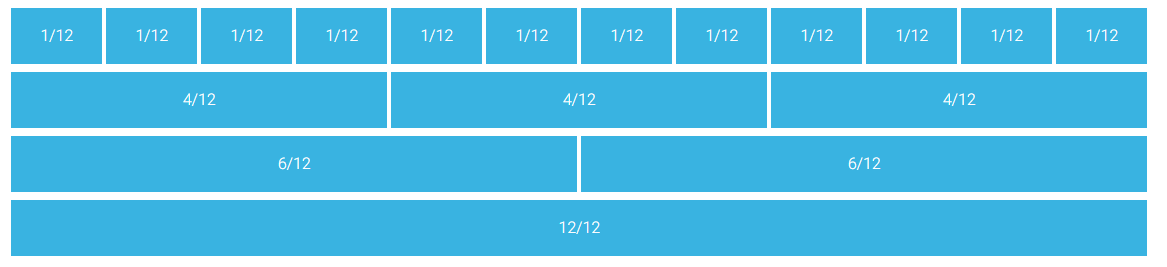
You can either use one column which will be 12 blocks long or use multiple smaller blocks. The only rule is that you cannot exceed more than 12 blocks in a row. The blocks don't have to be equal in size:
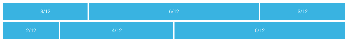
And you can skip some of the columns, as well as align them horizontally:
For more advanced usage you can check our docs:
3. Responsive breakpoints
Bootstrap is developed to be mobile first - it uses a handful of media queries to create sensible breakpoints for our layouts. These breakpoints are mostly based on minimum viewport widths and allow you to scale up elements as the viewport changes.
This is one of the most important features - in other words: you can define a different column size for different screen sizes. Bootstrap lists five different screen sizes, extra small (default), small (sm), medium (md), large (lg) and extra large (xl). Each size has a breaking point defined according to the table below:
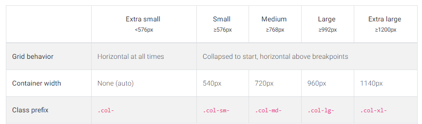
Bootstrap responsive breakpoints table
Coming to the conclusion - this super handy tool allows us to create content which will automatically adjust to the screen size. Let's try the following code:
Run the app and resize the browser size:
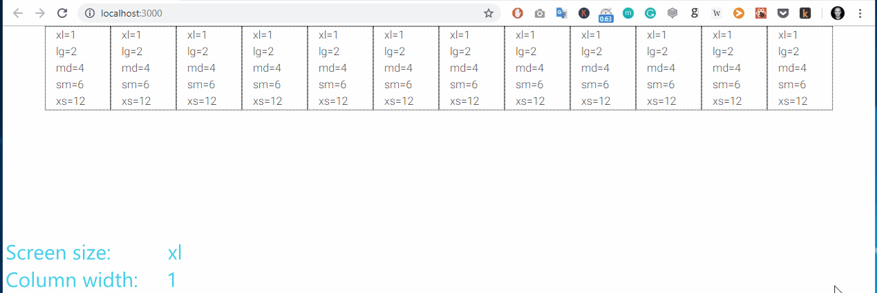
I hope that you now you can understand how easy it is to build responsive components using Bootstrap. Let's get back to our app. We want to create a two-column layout that will be visible on the desktop (extra large and large) as well as tablets in horizontal aspect (medium). For smaller screen size we want our columns to nest one below the other.
4. Responsive grid of our Calendar App
Replace the template of our app.component.html file with following code:
This will render the expected result. note that we have provided only a medium breaking point. Bootstrap by default assumes that we want 9/3 ratio not only for medium screen but also for bigger screens, as well as that we want everything which is lower than md to display on full 12 width.