How to Make an eCommerce App
While all eCommerce apps differ by what they sell, they definitely face almost similar challenges when it comes to developing and maintaining them. After analyzing 150+ eCommerce apps, I wrote this guide on how to develop eCommerce applications. It walks you through everything you need to build a eCommerce app.
If you have to take lessons on developing eCommerce apps, you should take a look at these eCommerce apps

While these apps differ by what they sell, they definitely face almost similar challenges when it comes to developing and maintaining them. What starts as a simple app built on top of iOS, Android Java, couple of backend languages and databases, quickly evolves into a complicated technology piece that can have as many as 15+ programming languages supporting it.
If you aren’t careful enough while building eCommerce apps, you can end up making more mistakes than you can count. Consider the example below.
John’s empty cart problem
John adds an item to cart when he was in London. He then travels to New York and logs into his account to complete the purchase.
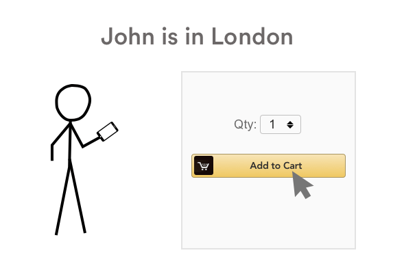

When he logs in, he sees an empty cart!
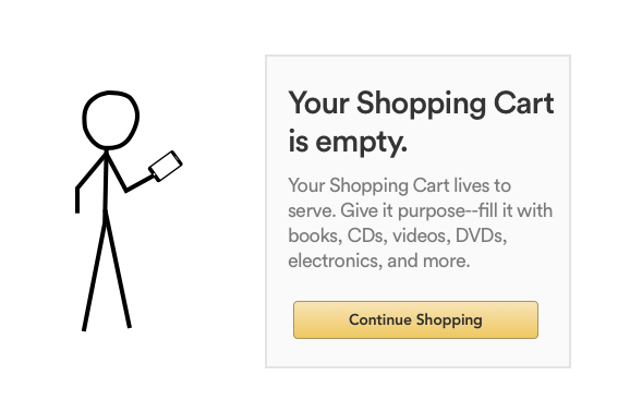
What do you think happened here?
(The answer is in the architecture section of this blog post).
Table of Contents
- How not to Develop eCommerce Apps
- A Better Way to Build eCommerce Apps
- Ecommerce App Scalability & Performance Challenges with this Architecture
- Benchmarks for Developing eCommerce Apps
- Using Domain Driven Design for developing eCommerce Apps
- Developing your eCommerce mobile application
How not to Develop eCommerce Apps
There are no highs and lows of the scale at which an eCommerce app should perform. But, right from the start, don’t just end up building something that looks like this.
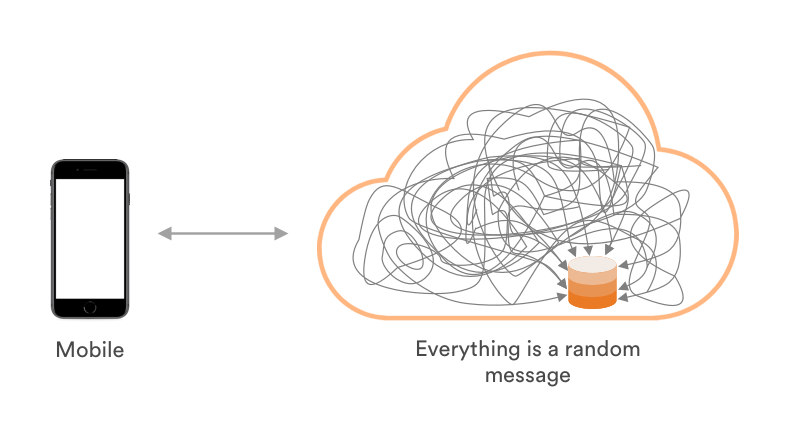
There are probably hundreds of reasons on why we shouldn’t build an eCommerce app like that. Some of the most commonly known reasons are:
1. Pushing changes gets difficult – No matter how small the change is, it gets difficult to push it across this app. It takes a lot of time for your development to modify this app for even tiniest bit of changes
2. At times it isn’t easy to figure out what’s causing your entire app to perform poorly
3. This app won’t scale beyond a certain number of users
4. Even if your brute force scalability, it will come at 10x the cost of what it should be
5. The development team cannot implement testing easily. Even if you want to follow TDD, ATDD or BDD, you won’t be able to, as the tests your developers would write won’t be able to cover entire code base
6. If one of the functionality fails to work, it could potentially take down the entire app
7. If a third party service breaks, it could potentially break your entire app
8. You will be forced to do everything in one language, one version and pretty much will have to use the same libraries. You won’t be able to leverage a diverse ecosystem
9. Your database will break, users will find that the flash sale discount that he just applied to a TV isn’t valid anymore
10. Search performance is poor as we have to pull information from a single database that will grow extremely large as the ecommerce platform usage increases
11. All you rely on is a fixed number of servers that are either overestimated or underestimated for the target delivery. To handle increased loads, you need to manual add more servers and take them down when the load fluctuates. This is time consuming and extremely capital intensive
I can go on, but you get the idea, right?
A Better Way to Build eCommerce Apps
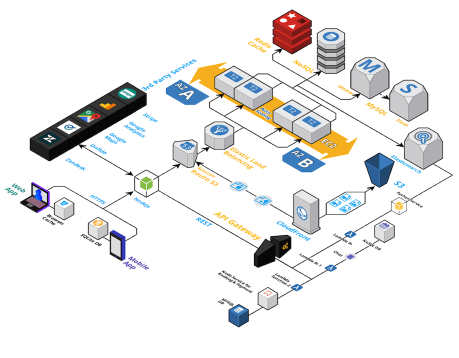
Now, with this type of an architectural layer, we improved the foundation of our system. When you compare this architecture with the previous system, the capabilities have been improved by:
1. Servers and load handling capabilities
If any ecommerce app was built on an architecture that we saw previously, we couldn’t increase or decrease servers to match the server load fast enough. But, now we have a load balancer in place. It helps you define:
- how you prefer to handle the incoming loads
- how to add or remove servers when there’s a fluctuating traffic
- how to set thresholds for costs
2. You don’t have to rely on a single language anymore
You can use Node.JS for API design and Python for server side programs – your choice!
If you understand what performance you can get from a particular language or a server framework, you are no longer bound by limitations to only use a few of them.
3. Can use different (types) databases to handle and store different information
Unstructured data like emails, customer data can be stored in a NoSQL database. Whereas any structured information will now be stored into a MySQL database. Using specific databases for specific usage not only improves performance, but also reliability in case of eCommerce apps.
We call this a Polygot database approach, you can read more about it here https://en.wikipedia.org/wiki/Polyglot_persistence
4. Partial separation of concerns
We have third party services operating in a separate server(s) from our core service. As we don’t control 3rd party services, they are a significant risk to our core infrastructure. If not well separated from our app infrastructure, their failures might cause your entire app to break down. Having third party services on a separate servers eliminates this risk.
5. Faster search performance with ElasticSearch
We now are using a Search as a service – ElasticSearch. It speeds up the way your system pulls information from your database using highly optimised indexing. It is worth noting here that search is one of the most frequently used part of an eCommerce app and has to perform really well.
6. Cache service
With a caching service, we look at the most frequently requested information, and create a data store (cache) for it separately. Now, when the same information is being requested by a user, it won’t go to your database, but, would instead be delivered from the cache.
But…
While this might seems like a good architecture for a proof of concept or an MVP, but it won’t work in cases where you are trying to achieve high growth or volume. eCommerce apps are supposed to follow a MVAP (Minimum Viable Awesome Product) philosophy right from the start.
Our diagram is fairly complex, let’s break it down step by step to see where it lacks.
Ecommerce App Scalability & Performance Challenges with this Architecture
1. No Benchmarks of for code scalability and performance
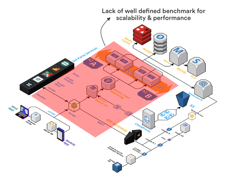
We do see information on how load balancers, server capacity and storage that we have – but we don’t exactly see how internal services are going to work with each other. So, that leads to a situation where we don’t know how to ensure “Adding items to the cart” works all the time, especially during a high velocity sale.
2. Database scalability and performance is not benchmark driven
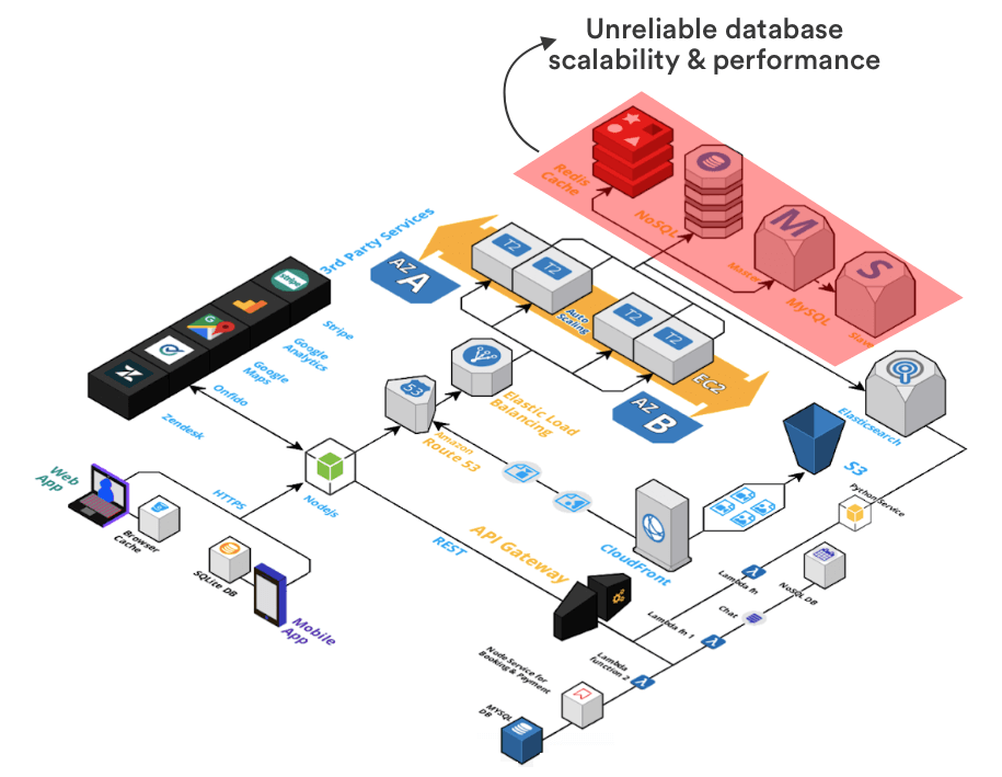
In this diagram we see that we have Database clusters that are connected with our services. There would be situations in which a particular database is heavily occupied by search queries, but our other services also need it for processing transactions. How are we going to determine which service to prefer? How are we going to decide from millions of possible problems which service to prefer? How are we going to make sure that information delivery is fast enough under all loads?
There are no definition of any of these things.
3. Resource and cost allocation of the system is unclear
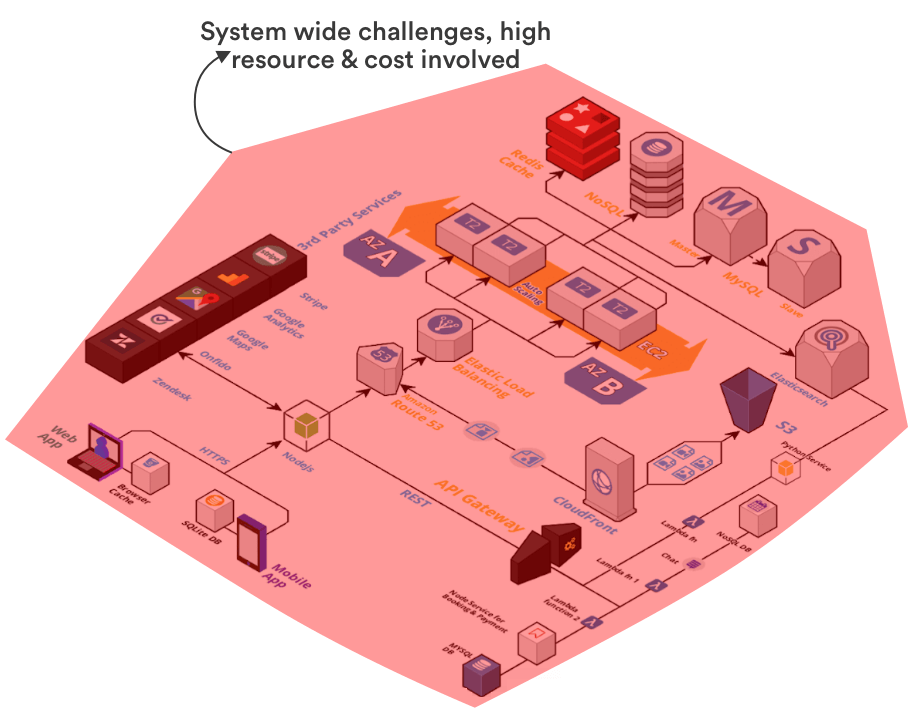
Simply put, we don’t know predictably how this system would perform at all. While we do expect it to perform relatively well, but it wouldn’t do so without having you bleed capital on unnecessary resources like costly servers, load balancers, etc without any empathy towards engineering best practices.
Let’s say thousands of dollars spent on advertising and influencer marketing did brought in 100,000+ potential buyers to your eCommerce app. If you don’t have a tech infrastructure that can scale reliably, what’s the point of spending all of this capital?
Benchmarks for Developing eCommerce Apps
From my experience of developing and scaling ecommerce apps, I will share a realistic scenario for a Black Friday sale. If you are doing decent volumes with your eCommerce store, these are the numbers that you are most likely to face:
- 200,000+ orders per day
- 20+ orders per second
- 2000+ product search requests per second
- More than 100M total server requests in a day
Now, this is a scale that most eCommerce apps have to develop keeping in mind.
Your goal is to make sure that your entire system is and what capacity it is capable of serving. And, now that we have these numbers with us, our thinking would shift from scaling entire stack to scaling different services (cart, product search, etc) to match these benchmarks.
We will now break down our app into different services each of which has its own goals to serve. This is called following a microservices approach.
Using Domain Driven Design for Developing eCommerce Apps
Since eCommerce apps are extremely complex and they keep evolving, it makes sense for us to follow a domain driven design here. With a domain driven design, we have specific teams and stakeholders responsible for each services.
Based on domain driven design, let’s evolve our eCommerce app’s server code into microservices.
This is what the evolved architecture would look like
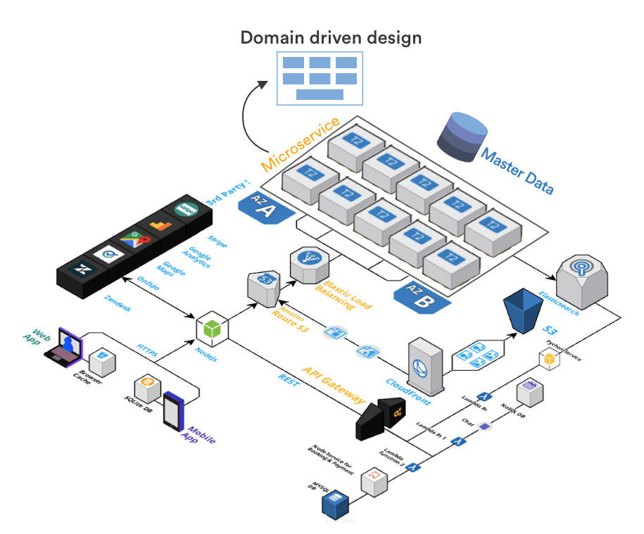
You’ll notice that our code is now divided into a bunch of well defined microservices. The image below shows you the top 10 microsevices that you would absolutely need in order to build a high performing, scalable ecommerce app.
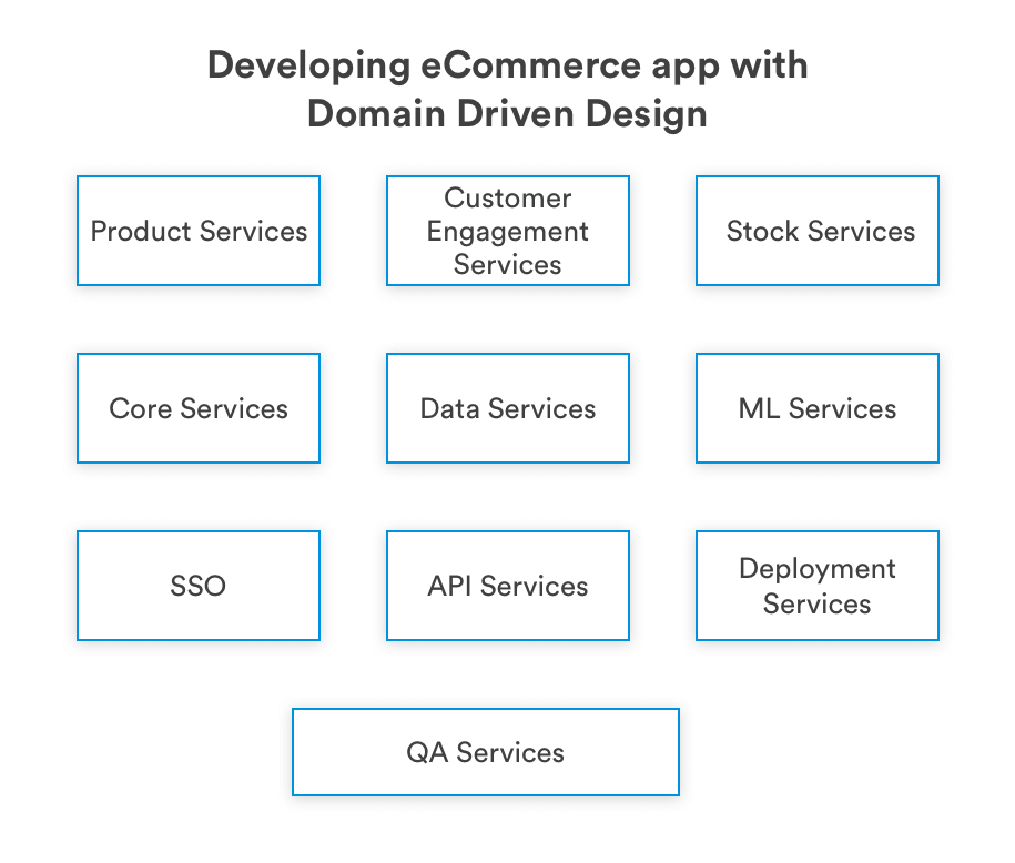
While, I am going to cover developing eCommerce microservices in another blog post, I walk you through why they are extremely important for eCommerce apps.
Lets take a look at the Product search services – It should be able to handle 100M+ requests in a day. If we break down this microservice, you will find this service has:
1. It’s own parameters for load balancers and scaling
2. Well defined server RAM and Memory consumption
3. Has its own dedicated database from where it can pull and show information. No other service can use this database
4. Its own API to communicate and respond to user search requests
5. Has a well defined boundary of what it can or can’t do
Now, let’s say if from a single server based service, you can at max only deliver product search to 1000 concurrent customers, you easily know how many servers it would take to handle 10,000 concurrent product search requests (1000 requests ~ 1 server, 10,000 requests ~ 10 servers). And thus you can reliably scale each of these services.
Another benefit of following a domain driven design is that the app becomes 100% testable. And, if you are planning to automate code deployment to your app, this would be extremely helpful.
All in all, this is what this architectural was actually benchmarked and tested for.
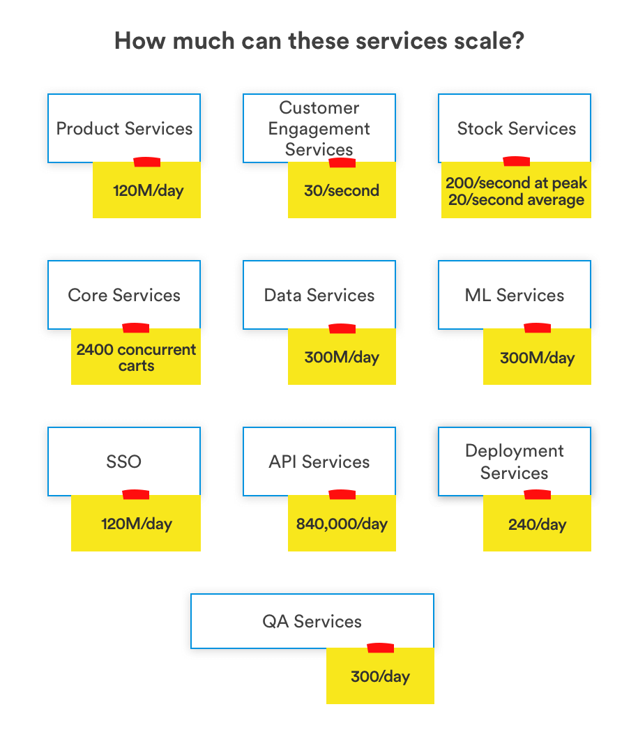
If you interested in reading about eCommerce frontend development of your app, here’s a blog post that I wrote on How to make an eCommerce site using ReactJS?
Scaling services for demand and performance
Now that we know what each service is capable of, individual stakeholders of each services can now scale these services up and down independent of entire ecosystem. This would also tell you what parts of your ecommerce app aren’t good enough for business requirements. You can exclusively focus and improve those parts.
For example, if you see your implementation of ElasticSearch isn’t good enough to deliver product search results in less than 200ms with a load of 1,000 concurrent users, you can look for alternative solutions. You can test alternatives and see how they work and deliver results, without significant investment and without breaking anything else.
What really happened with John’s empty cart?
Coming back to the empty cart problem that I shared at the start. Without well defined microservices, when John added an item to his cart, it was added to a geo-local database.
Our app assumed that John lives in this region and won’t move out. Without domain driven design, stakeholders, product managers and developers had no idea that this could actually happen to them.
We usually build a golden record to handle such use cases. When we do that, we have a well defined and controlled boundary of data and John would be able to see this cart no matter where John lives.
I hope what you have learned so far improves upon your understanding to how to build a cloud backend for eCommerce apps.
If you are interested in evaluating Serverless tech, you should definitely checkout this blog on building eCommerce apps using Serverless
Developing your eCommerce Mobile Application
We will now start working towards building your understanding of ecommerce mobile apps. The way we will move forward now is by looking at the following aspects of ecommerce apps that are extremely critical to get right:
- Dynamic UI
- Building Product screens
- Elements of your app and how you should develop them
- Implementing reusability within your ecommerce app Offline capabilities to improve app user experience
Ecommerce apps with Dynamic UI
A consumer usually may or may not notice this, but as an ecommerce app developer you should know this. eCommerce apps undergo constant UI changes, some are a part of improving user experience, others are there simply because they are for a one time observable event like Black Friday.
Now, simply pushing UI updates to your app each time a new event is near isn’t possible because:
1. App Stores aren’t very reliable in release management, and approval of an updated app version could happen sooner or later.
2. Asking users to update their apps for an event like Black Friday or a UI intended for a Flash sale would only result in user churn
So, how would you solve this?
One way to do that is to plan upfront and compile all app UI in a quarterly app update. You can change this update frequency based on how frequently your users would be willing to update their app. But as a benchmark, don’t go below less than 2 months.
Now, when an app user updates their app, this is all what they are going to see.
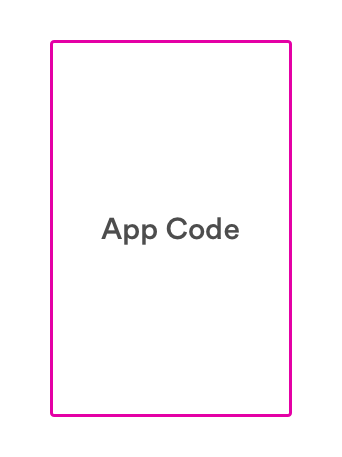
While, this is what we are actually shipping
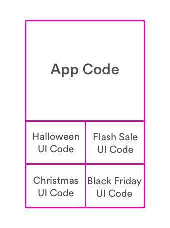
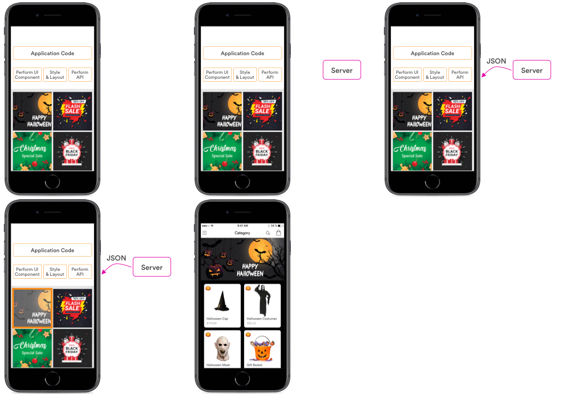
These user interfaces can be activated remotely when you wish to. Here’s what a user that has received a dynamic UI based ecommerce app sees during Black Friday, Halloween, Flash Sales and Christmas.

How do dynamic UIs work?
No matter how complicated this may sound to you, they are not that difficult to implement. While we package all of these UIs in one single app update, all we have to do to activate or deactivate these contextual user interfaces is just pass a message from our servers to the app.
A simple JSON message is sent over the app and activates a UI. The illustration below shows how it works.
Bloated app size
A huge concern here is that with dynamic UIs, we often end up increasing the app size. And increasing app size is one of the many criteria’s that violates the principles of developing an eCommerce app.
This is where we see React Native significantly outperform native. We will talk about that in a bit more detail in the next section.
App updates over the AIR
If we have to push updates to your app, we either have to do it using upfront heavily bloated app size or with lengthy (unpredictable?) app store/Play store review processes.
If you are planning to use React native for ecommerce application development, you can simply integrate your app with a service like CodePush. Using CodePush you can deliver small scale UI updates directly to your app users.
React native again reduces the app size here as we don’t need to package everything in UI upfront, we can simply push the UI using internet.
Further reducing your app size
Ecommerce apps uses a lot of images, and you won’t believe how unoptimized images are still being pushed to eCommerce apps. Optimizing images can reduce the app size by 20% in eCommerce apps.
To reduce image size, consider the following:
- Use compression tools like TinyPNG, compress image without losing any quality
- Ensure that very large images are not added to the app. Have image size validation scripts that triggers an alert if the images getting added are more than 50KB
- Avoid adding image resources, instead use XML drawable and vector drawable wherever possible
- Reuse same image in multiple places, color filter and rotation logic should be used
If you want to develop your app with best practices when it comes to app size. It is recommended that you should write a script, an app size watcher to keep track of app size with each build. There are several plugins available that integrate easily with your CI tools and can keep track of your app size.
How to build your product details screen?
One of the most important parts of an eCommerce app is the product details screen. If you plan to serve a large customer base, be prepared to have a screen that evolves extremely fast. With developers pushing minimum 10 different updates/changes to this screen everyday.
Product details screen is where users are going to decide whether they want to buy the product you are selling or not.
Let’s take the example of Groupon’s product listing screen here. There’s whole lot of design aspect that was applied by Groupon here to scale and deliver a product screen that could supports more than 200M app users.
Here’s how it looks:
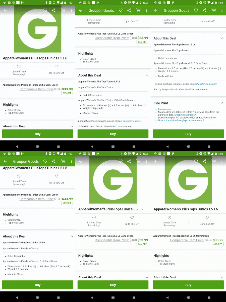
Now, this may not be the traditional illustration of design to many. What I instead mean’t here in context to design was the UI engineering design. Let me explain you a bit more:
- Product screens are often not developed by one, but many teams
- They evolve quickly and require high agility
- Each and every aspect of this screen has to be optimized for memory and load times
- Handling complicated edge cases
Clearly, if you don’t deal with this properly – you are in a for a ride of your life!
Groupon takes an entirely different approach to what most other eCommerce providers do while developing this screen. They break this screen into small subunits that work perfectly with each other, but are developed independently and are handled by separate teams.
So, a screen like this can be broken up into small components like these:
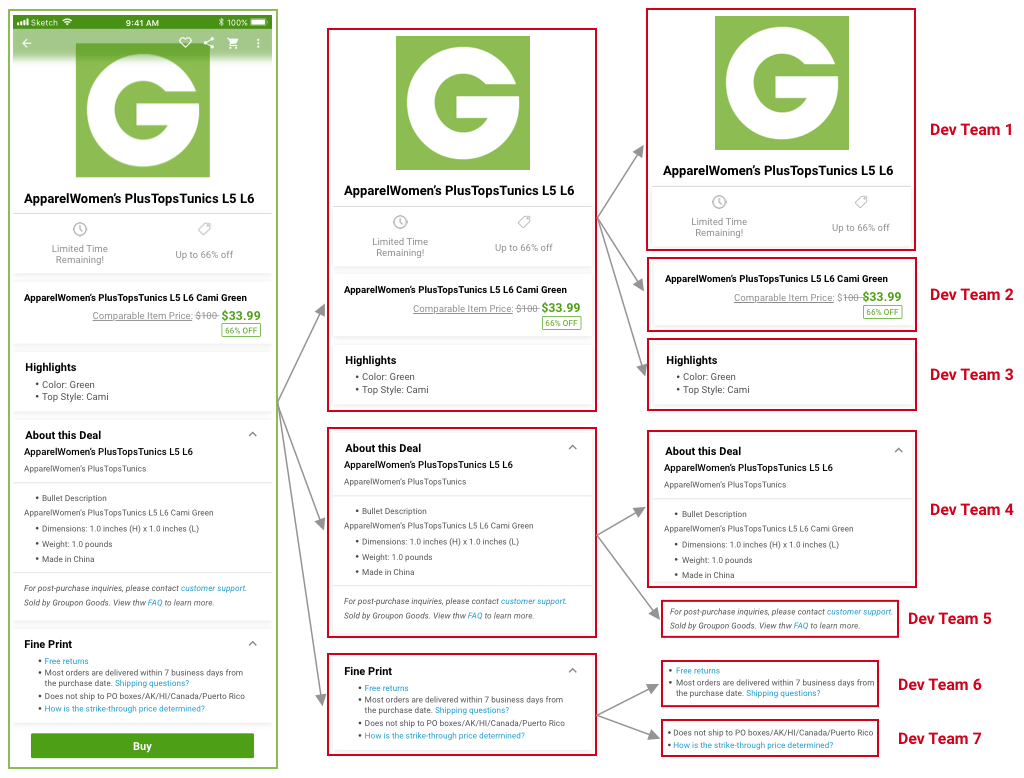
I won’t get into deep technical details here. But, this separation is the exact reason why developers working on “highlights” can update “highlights” section and not impact the overall performance of the screen. Whatever they do in “highlights” section is optimized and tested for performance. And the new “highlights” code can be reliably released and integrated with the rest of the screen.
Optimized performance
Following this modular approach to developing eCommerce app product screen not only helps you efficiently showcase long lists of items, but it also helps you efficient show only the part that’s available to the app’s screen
Add or subtract features with ease
As screen elements are independent of each other, adding or removing them takes 10% of the original effort had this practice not been in place. All of the features of the screen can be developed in total isolation.
Better utilize phone’s memory
Apart from optimized consumption, we get a lot more control over what we can do with the phone’s memory here. Groupon effectively pre-load elements of the product screen on phone memory that are yet to be displayed. They do that to drastically improve the load time to 1/10 of what it would otherwise be.
Reliable cache
Groupon takes it a step further while developing their product screen. They have implemented a reliable cache and recycle information that they use effectively re-display list items efficiently.
How to develop Product Image elements?
I talked about the product feature screen in the section above, and I will now pickup an element from it and walk you through real life complexities here. For the sake of simplicity, I’ll go with developing product image elements for an iOS based eCommerce app as I feel it would be a lot more intuitive for everyone reading this.

Challenge: Optimize a high performing image screen and eliminate uncertainty in performance
To build an image viewing element in our iOS app, we usually have three options:
- ScrollView
- CollectionView
- UIPageViewController
If these are new to you, don’t get discouraged by their names. Think of them simply as the way to implement image view elements in your app.
Let’s now evaluate each of them as we move forward and find out which one will give you the best performance.
ScrollView
Your developer places all of these images inside of ScrollView, the functionality would work fine and the performance for most parts would look just about right as well.
But then, you hear an app user complaining about app taking too long time to show images. You went back to your QA and dev team, raised some tickets on your project management system, only to find out automation tests and manual tests returning the results with no errors.
So, what’s really happening here?
When your developer built this product image screen in your app it was implemented using ScrollView. This ScrollView works fine for around 5-10 images with varying degree of results, but for most of the part it won’t show you any flags initially. But when you have a customer that is going to upload 30-40 images of a product, downloading these images in ScrollView gets extremely expensive for your app’s performance.
This is exactly what you weren’t aware of, your developers weren’t aware of, and your QA wasn’t aware of.
Using CollectionView
Now, you can build this using CollectionView as well. But according to me, it’s an overkill. It was built for not just left and right, but up and down movements as well. I will get back to you on why I wouldn’t go with CollectionView at the end of this section.
On using UIPageViewController
I would straightaway recommend you to go for UIPageViewController instead. It is the same exact thing that you see when you scroll left on AppStore. And, It is also the same implementation that you find in iBooks app as well. iBooks can help you scroll through hundreds of pages without any performance issues or apparent lags.
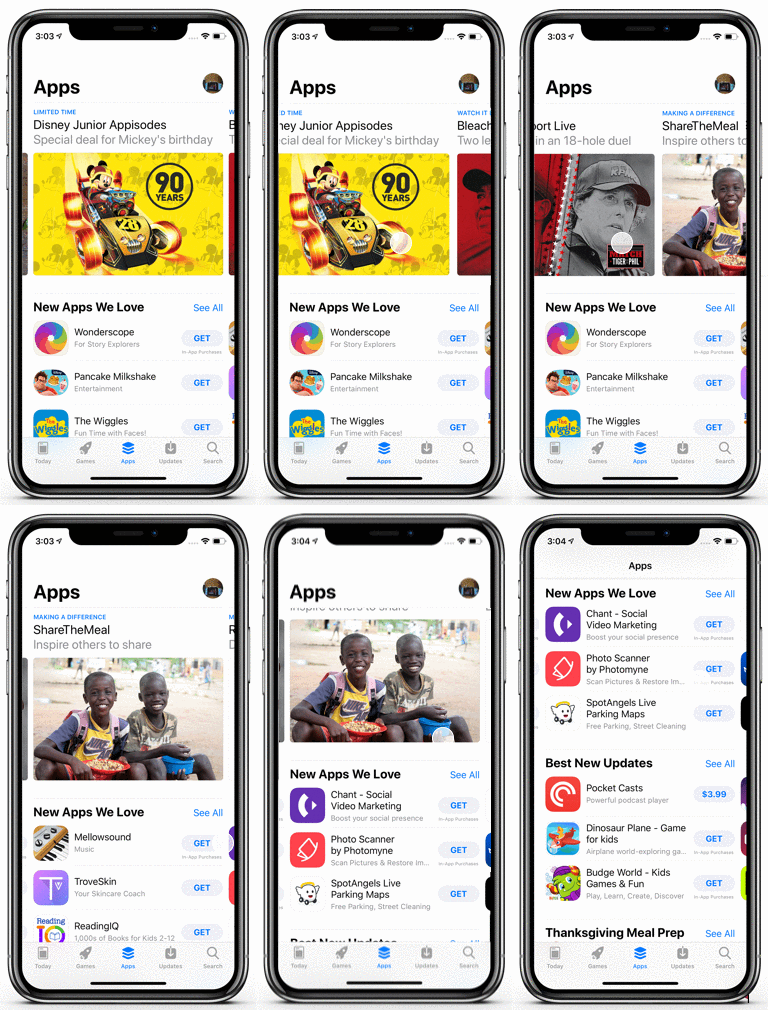
Now, getting back to why I wouldn’t go with CollectionView? First reason, engineering is about avoiding overdesign. Second reason, every unused or partially used library increases the size of your application. App size is a major concern for eCommerce apps as each and every percentage reduction in size leads to high sales and more adoption.
Standardizing icon images across screens on your app
So far we’ve talked about perfect components across a screen. But, let’s now look into a completely different type of optimization that you can do with your eCommerce app – Standardized icon images.
![]()
What I prefer here is to define upfront:
1.How these icons would be displayed– This includes defining all business rules for display and settings that should applied to the images
2. Make sure that the element that’s going to use these icons doesn’t have to worry or do anything to load and display these icons
I do that because after years of developing ecommerce apps, I’ve observed:
-
Developers have their own ways of implementing even the simplest possible things. The performance, code quality and consistency of doing something in this case depends upon the skill of developer. This could potentially induce a risk.
- Using modular approach towards developing apps result in higher quality. For example, if an image (icon23.png) is attached to an element, there’s no possible way for anyone to know how deleting this file system image would actually impact the app. Icon23.png could be attached any of the 200 screens that we have in our app.
- You can’t document enough in the software world. And, even if you do, documentation alone isn’t enough to resolve challenges that are widespread in the software development world.
When I look into images that are extremely commonly used across the app, I see that the following are extremely common:
- Loading spinners
- Downloaded product images
- Placeholder images
- Download failure icon
- Feature icons
After building a list of such images, I would define one central place for each of them where I define how they would be loaded and displayed. Even the elements in which they will be loaded won’t have to worry about how this will happen.
If in future, If I decide to increase the size of icons from 12px to 14px in length, I won’t have to worry about applying the same change to 100s of screen. This not only saves a lot of time, but also helps us avoid the chances of any degree of compromise on performance or code quality when a developer updates this. Any changes would eventually be tracked an linked to this central location, and we can control what happens here.
Offline persistence in your app
If you are building an app for shopping for users on the go, giving them the ability to shop from whenever they want – you better be prepared for poor and intermittent network connections. Most likely, your app users won’t know if they have a poor network coverage, or whether your app isn’t working. They are most likely to blame your app!
Your app’s user would find it irrational to lose information that was just there a few seconds ago. Even if it vanished as he/she moved from one screen to another or minimized his app. Now, this is actually a poor implementation even from an engineering standpoint as well. As engineers, we don’t control the network, but we do definitely control some of the information that the app fetches from the server.** If done properly, the app can actually retain some information and function well even when there’s no network connection.**
I’ve written an extremely detailed blog post around this a few months ago, if you want to read it in detail, here’s my take on building offline mobile apps.
Increasing reusability for eCommerce apps
For organizations that have multiple eCommerce apps, it often gets too expensive to develop these apps from scratch and maintain them. If that’s your use case, I would focus on identifying the foundational parts that are often common across these apps and just induce redundancy.
Once identified, I prefer to package them in form of an SDK and consume it across multiple apps.
Take the example of offline catalog storage services in your apps. You can easily see that this is something most of your apps would have as a feature. Now, while building this offline catalog service for the first time, you can carefully package it in form of an SDK.
When you build another app that needs a catalogue functionality, all your developer would need to do is to call this code and that’s it, it will work out of the box.
Adidas and other pioneers of mobile technologies in eCommerce leverage this extensively, they have SDKs that are being consumed in multiple other apps.
Concluding
That’s pretty much it for the blog post. I hope that I was able to walk you through the complexities involved in ecommerce application development, and when you develop ecommerce apps I hope some of these strategies would solve real growth problems for you.
